Design tokens
Spor offers tokens for color, rounding, outlines, shadows, and animations, making it easier to apply and maintain shared design decisions.
What are design tokens?
Design tokens represent all the recurring design choices that define the design system’s visual style, and contains all the values you need to construct and maintain a design system. They are reusable values that define the visual style of a product, such as colors, typography, spacing, border, and shadows.
Tokens are used instead of hardcoded values to ensure that the design is flexible, easy to update and always follows the standard set by the design system.
They are the common rules and guidelines that bind everything together. What color can my component have? How should the corners look? How much distance should there be between each element?
Color
Semantic color tokens give colors a clear purpose, helping ensure consistent and meaningful use of color across Spor and the products that use it.
Spor color tokens work in three layers. The foundation is a palette that is a fixed set of raw colors defined by name and shade, like green.100 (#CCEAE4). On top of that, each color gets a friendlier alias name that describes what it looks like, such as seaMist. The third layer is semantic tokens that are named slots that describe the purpose of a color rather than its appearance, for example surface.brand, outline.core, text.disabled etc.
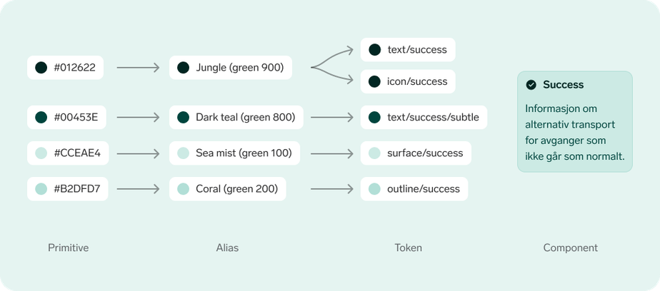
Semantic token names describe their purpose and intended use. The first part defines the type of element: bg (background), surface, outline, text, or icon. The second describes the context, such as subtle, disabled, brand, info, or critical, while an optional third part defines the state, such as hover or active. An example of a token name is surface.info.hover. This structure sets the stage for related tokens, such as surface.disabled, text.disabled, outline.disabled, and icon.disabled, to work together as a consistent set.
Additionally, all color tokens hold on both a lightmode value, and a darkmode value. Therefore, when using tokens like surface.brand or text.brand, the colors will automatically switch based on the active theme.
Background color
Spor uses 3 different background colors that should be used both in app and on web. Background color is used to group components, to separate different types of content or to lift something from the background to highlight something that is clickable. It is important that we are consistent in the use of background color. Look at the whole of a flow and how the content is connected. It is important that similar elements get the same design and this also applies to background color.

Component color
Components have more room for color use, but there should always be a focus on readability and contrast. Specific components use, for example, different colored surfaces to signal a difference in importance. You can also use specific colors to highlight an element, or to hide it.
When using colors other than white and gray, it is important to check the use of the colors you want. Are these signal colors that are used for alerts, will it compete with navigation or user choices?

Color and icons
Icons come standard as darkGrey in light mode and white in dark mode, but can be used in other colors in special cases.
icon.highlightis used together with highlighted text, eg textlinks.- Icons can also inherit semantic roles, such as
icon.infoandicon.critical. - Icons that belong to a product can be used in the product color.
Color and states
Spor-components have a systematic use of design-tokens to show interactive states. We want the user to be able to recognise similar interaction regardless of whether they are on the web or in app or whether they press a button or add a document.

For example, most of the buttons use a darker color value on hover, before they get a lighter color value when you press down on the button. Except for the Add button, which often complements other types of buttons and can be used where you want more buttons together that have equal weighting. Disabled button state will be the same across all types of buttons so that the user recognises disabled elements.
Color guidelines
While there is the possibility to override colors in components, we strongly recommend not to do so. If however you must, for various reasons, follow these simple guidelines.
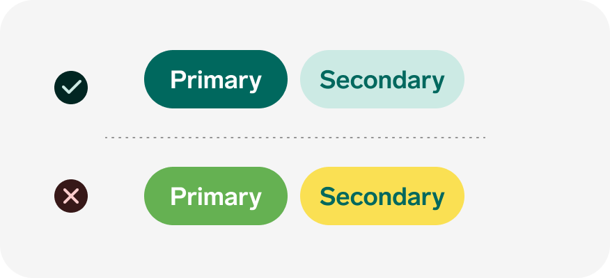
Don't use custom colors:
You should not use other colors than those that are already in a component or that are derived from design tokens and are based on existing design.
Don't have low color contrast:
Text, icons and components must follow the WCAG requirements for minimum contrast. You can check this through plugins, or online tools.
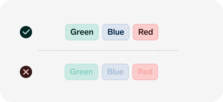
Don't use just colors:
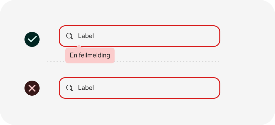
It is not good enough to only use color on it's own to give feedback to the user. There should always be a label or icon to give the color the right context.
Rounding
We use largely rounded components to create a softer user interface. The rounding usually follows the size of the component. Small components have little rounding, and large components have larger rounding. There are few cases where we do not round components or design elements and states. But you have exceptions like full-screen elements, images, image galleries or where two elements meet as in open search fields.
An easy way to see which rounding you should use is to follow the rule of thumb: components with 1-2 lines of text or very compact elements will always have rounding of 12 px. When there are more lines horizontally, such as cards or boxes, we use rounding of 18 px. In addition, 24 px rounding is used on drawers, 30-36px rounding on components that are to be completely rounded such as buttons.


Outline
Spor uses outlines to structure content, define components or distinguish between states. Components always retain the same border-width between different sizes. While states can change border-width based on interaction. An example of this is Hover and Focus state on components with outline, such as the add button.
1px outline
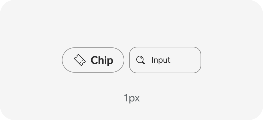
Spor-components usually use 1px outline in default state. This is standard for all boxes, dividers and form elements.
2-3px outline
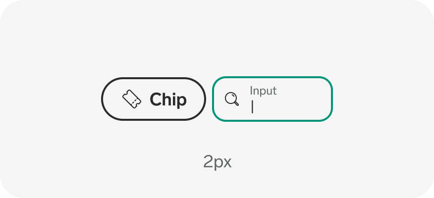
Used as weighting on components for different forms of interaction. To make it easier to distinguish between keyboard focus and hover, changing the outline will help the user.
Dash
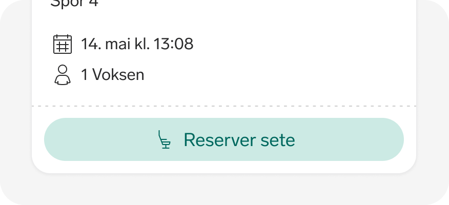
Dotted line is only used to separate content within a component. It should not be used as a divider between content or as an outline on components.
Spacing
Spor uses a spacing scale based on the 6 multiplier, where the default value is 6px. It has standard values that you can find under design tokens that go up to 180px and down to 3px and 0px. Components are designed and built based on the spacing scale and other token values.

Shadow
Most components in Spor use some form of contrast against the background, whether it is color, outlines or shadow. Shadow is used to lift something from the background, whether it lies over an element or just for contrast. We also use shadow to clarify that something is clickable.
Not all clickable elements have shadow, such as input fields and buttons. Sometimes shadow is only used in certain states of components, to clarify an action. Components with strong colors or outline do not need shadow. We have three levels of shadow: Elevation 1, Elevation 2 and Elevation 3. Different levels of shadow can be used to create a hierarchy of importance.


Animation
It is important that the length of the animation and the attributes that are animated do not seem distracting or make it harder to navigate for the user. There is a big difference between the length of an animation when you change button state and when a full-screen drawer should open.
We have set up three basic animations that you can use when setting up transitions between states. These define three different curves on how the animation should be performed: Slow, Medium, Fast. If you want to define your own animations, it is important to think about how the whole user-flow is experienced, not just the element you are animating.
Slow
Slow should be used where you need slower animations and is well suited for large objects or where the element should move over a larger distance. This lasts for 0.5 seconds and has a larger easing towards the end.
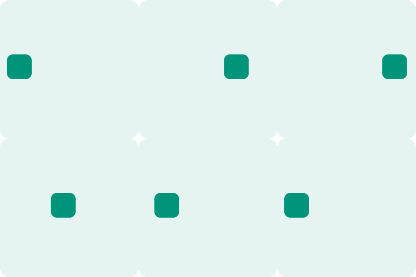

Medium
Medium, as the name implies, is in the middle and should be used for medium-length transitions. This is probably best suited for elements that need to move or change width/height. This lasts for 0.3 seconds and has a short easing towards the end.
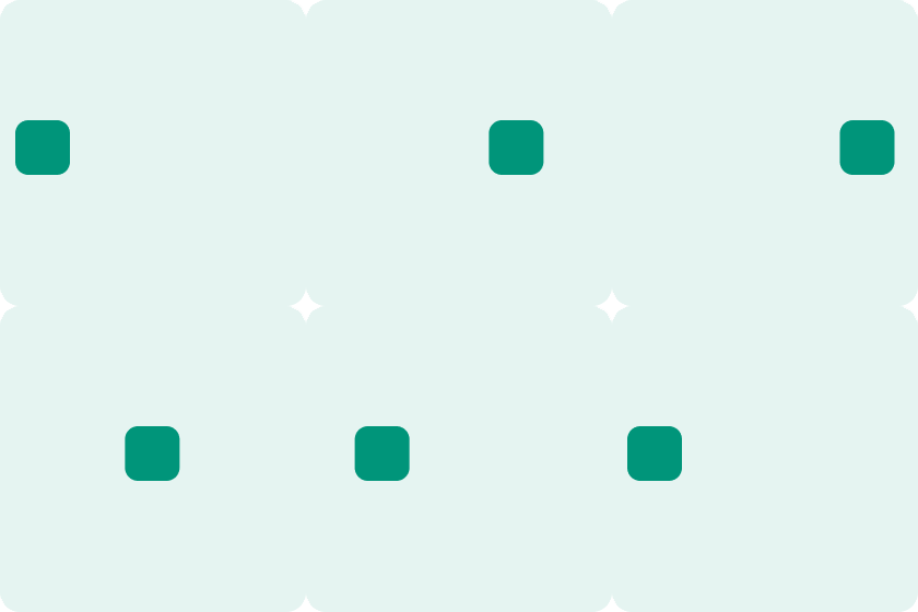

Fast
Fast is a very short animation and should be used where you need to complete the action quickly, or where there are not big differences between the steps. An example would be between two states on a button. This lasts for 0.1 second and has very short easing at the start and end.